Components / Widgets
W
woo-auth-button

Auth Button

Render sign in and sign out actions.

Setup steps

  1. Open the FramerWoo plugin and insert Auth Button.
  2. Place this in a global navigation, utility bar, drawer, or reusable site section.
  3. Configure the component behavior in Framer's property panel.
  4. Style its default, responsive, loading, and empty states on canvas.
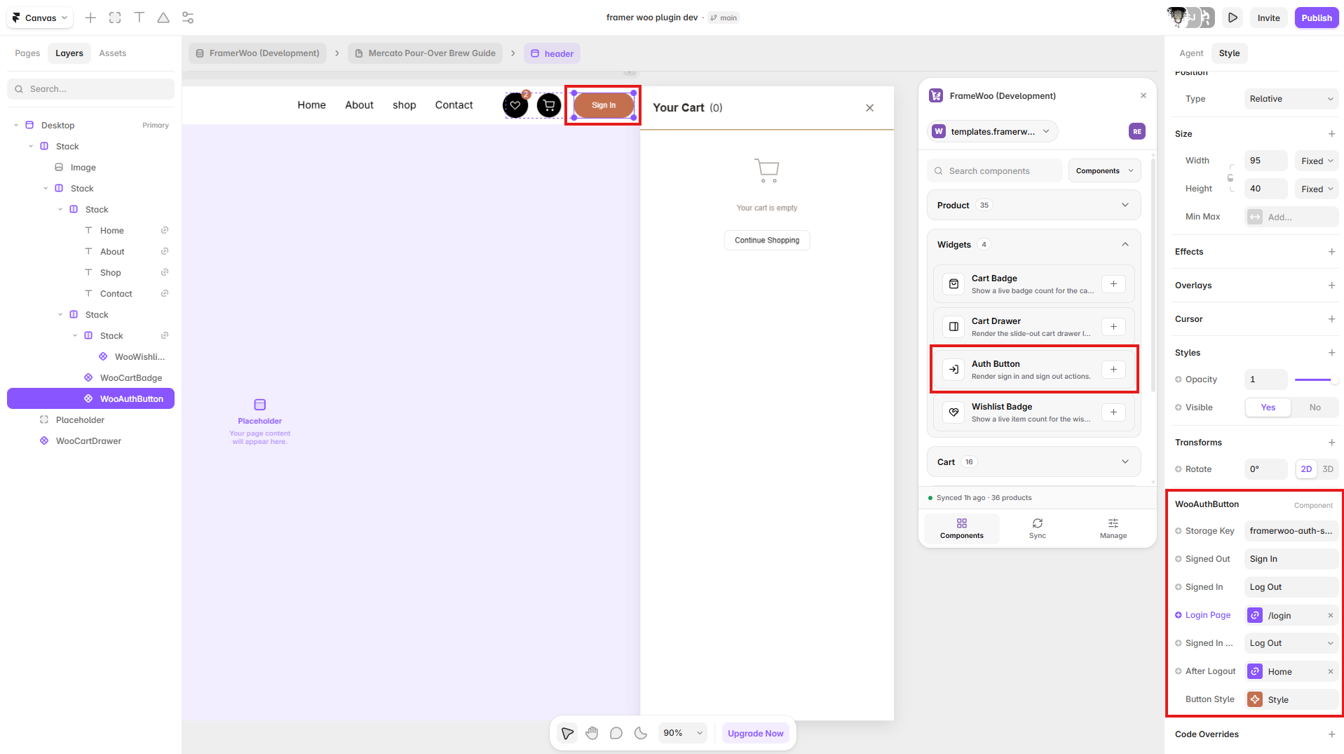
Auth Button displayed in a Framer site header with authentication controls open in the property panel
Insert Auth Button in a global navigation or account area, then configure its signed-in and signed-out actions.

Property panel

Use Framer's controls to connect context and match your visual system.

Context
Controls the WooCommerce or CMS data source used by the component.
Content
Controls visible labels, values, formatting, and empty-state copy.
Style
Controls typography, colors, spacing, alignment, and responsive behavior.
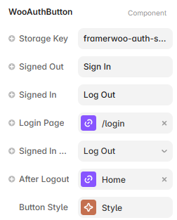
Framer property controls for the Auth Button component
Auth Button controls for storage, labels, login navigation, signed-in behavior, and logout destination.
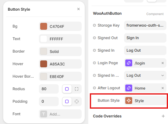
Auth Button Style controls showing colors, border, hover, radius, padding, and font options in Framer
Open Button Style to configure colors, borders, hover states, radius, padding, and typography.